
The ultimate plant encyclopedia app.
Plantopedia


The Solution
By bridging the gap between knowledge and action, Plantopedia transforms plant care from a daunting task into an enjoyable and rewarding experience for users of all levels of expertise.
Plant owners struggle to understand the differences between each of their plants’ care requirements and are overwhelmed by the amount of contradicting information provided online.
I developed Plantopedia to help take the guesswork out of caring for houseplants by providing users with comprehensive and reliable information on plant care requirements, practical tips, and timely notifications to ensure the plants receive the attention they need to thrive.
Project Duration
12 Week Project
My Role
Sole UX/UI Researcher and Designer
Tools
Figma, InVision, Loom, Miro, Zoom


Secondary Research
To gain deeper insight into the issue and better understand the user’s needs, I conducted secondary research and pinpointed
3 main obstacles encountered during houseplant care.
The complexity and variability of plant care requirements can complicate the caregiving process, especially with an overload of information found online.
People have a hard time diagnosing and troubleshooting plant issues without guidance.
Keeping track of consistent watering schedules, fertilizing routines, and other maintenance activities can be difficult to remember due to life’s busy schedules.

Primary Research
My objective in developing a research plan and distributing surveys via Google Forms was to reveal the main issues that lead to houseplant death and ultimately to uncover the areas of improvement in users’ plant-care habits.
Survey Analysis
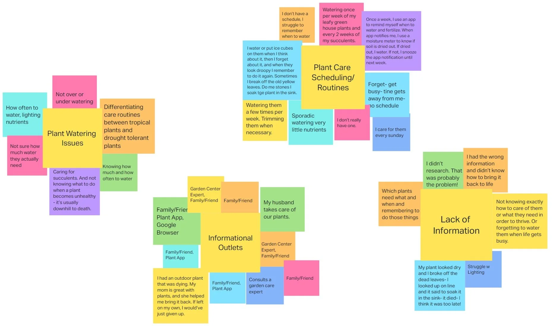
Affinity mapping allowed me to organize and make sense of the feedback I received during my development process. By visually grouping related pain points I noticed prevalent themes emerging: It’s often a scarcity of correct care information rather than a lack of care for plants and users are unsure of who to consult for their plant issues.
Key User Insights
Insight #1
Inconsistent care practices lead to a decline in plant health because owners are struggling to maintain a consistent care routine.
Insight #2
Lack of plant care knowledge and timely intervention cause their plants to decline even further, frustrating the plant owner.
Insight #3
Identifying and diagnosing plant issues can be complicated and cause the plant owner to get discouraged or even give up on their green companion.
Example #1
6/10 plant owners exhibit sporadic watering and nutrient provision, often neglecting their plants until they appear unhealthy.
Example #2
7/10 plant owners admitted to not researching or seeking help until it might be too late to save their plant.
Example #3
“After struggling to figure out what’s wrong with my plant I’ve given up and thrown it away” - Participant
Jobs to be done
The jobs to be done part of my project helped me better understand the users' needs, pain points, and motivations. This guides the development process to focus on creating features that will address those needs and deliver value. The following jobs stuck out to me:
Job #1
When I am caring for my plants I want to track my watering, fertilizing, and be reminded to do so to avoid over/under watering or over/under fertilizing.
Job #2
When I notice my houseplant declining I want to understand why it's dying and figure out the cause so I can rehabilitate the plant back to life.
Job #3
When I have a plant care question I want to trust that I’m receiving the correct information so I can save my plant from declining further.
Problem Statements
As a designer, my “How might we” statements gave me a better understanding of what functions to prioritize in my app layout. After pinpointing the key problems plant owners face I was able to list them by priority.
How might we implement an enjoyable way to keep track of a plant-care schedule to encourage users to tend to their plants before they forget about them?
How might we relieve the overwhelming feeling of caring for an unfamiliar plant when people buy plants they have never owned?
How might we display plant-care information that allows consumers to take an interest in/and understand their plants better?
How might we differentiate the care routines of each plant in a way that is easy to understand and keeps plants thriving?
How might we remind people when it’s time to care for their plants?
After analyzing these jobs I realized I needed to emphasize the tracking abilities of my app so users can customize their reminders, and use a checklist to feel a sense of accomplishment after completing a plant-care task. I also uncovered the importance of including a self-diagnosing feature to help users solve their everyday plant issues within seconds.
Competitive Analysis
To better understand what kind of solutions work best on a mobile platform I completed a competitive analysis of a few plant tracking apps on the market.
This gave me the ability to better understand how a mobile platform can be formatted to keep the user engaged and on track of their tasks. A common theme I found was how each task utilized a checkbox which helps the user feel accomplished once completing a task.

Ideation
To create a general idea of how I wanted to design my screens, I created 8 rough draft sketches.
My competitive analysis highlighted the importance of having an upcoming to-do list on the home page that ties in with each specific plant’s page.
My survey analysis emphasized the importance of providing a troubleshooting option to help users diagnose their plants quickly.
My “How Might We” statements also helped me keep in mind other important features I want my project to include such as reminders, care plan customizations, and correct plant-care information.
User Stories
To determine the key features necessary for my project and therefore create an MVP (minimum viable product), I developed user stories consisting of essential functions that focus on the core values of my solution.
1
As a user,
I want to keep track of my different plant care metrics and routines so that I can avoid over or underwatering specific plants.
2
As a user,
I want to understand when to water my plants so that I can prevent my plants from declining in health.
3
As a user,
I want to be reminded of when to care for my plants so that I can avoid forgetting about them and keep them alive for longer.
4
As a user,
I want to diagnose an unfamiliar plant pest/disease so that I can save my plant from declining in health.
My site map visually represents the applications' main screens with their responding features and functions. Creating a site map allowed me to decide where I would place each function within my project, including where the troubleshooting articles could be found, and where the plant care to-do list could be viewed.
In some cases, I found displaying a feature in two locations gave the app a better organizational flow. This allows the user to locate their information intuitively.
For example, my user stories emphasized the importance of placing the diagnosis page on the primary navigation bar so users could diagnose a plant at any point in their journey.
Site Map

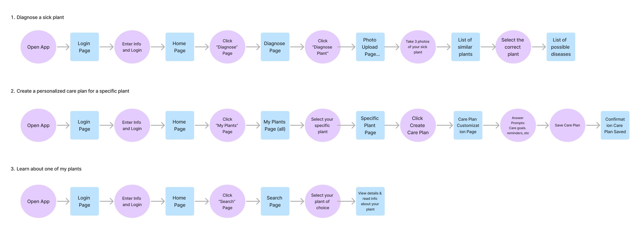
User Flows
Once I created my site map, I then mapped out 3 separate user flows that would be crucial to the survival of users’ plants. By doing so I could determine where each click could take the user in my application, but more importantly, why. The three user flows I found to impact the health of users’ plants the most were determined by my primary research and how might we statements. They include:
Troubleshooting or diagnosing a sick plant
Creating a personalized care plan for a specific plant
Learning more about one of your existing plants
I found myself making more edits to ensure the usability of the app remained intuitive and solved the users' issues.
For example, one idea that arose after mapping out my user flows was adding buttons that would help tie each flow together. I ended up adding an “add plant” button on the results page allows the user to immediately add their sick plant to their library instead of having to do it manually from the “My Plants” page.
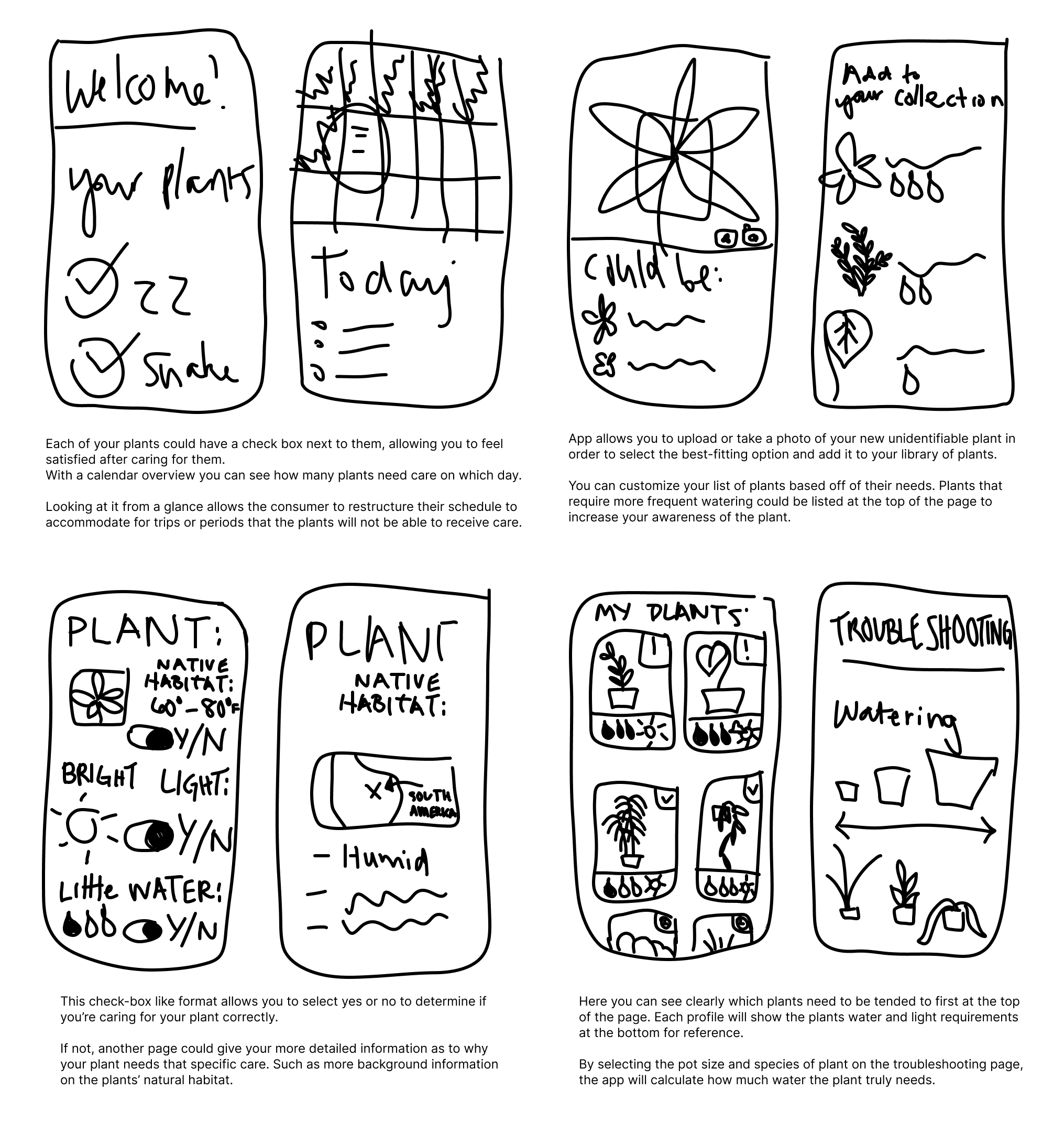
Sketches
The real magic began when I started bringing my ideas to life. By utilizing the Carazy 8’s technique and concepts from other applications I’ve used, I was able to draw out streamlined sketches for my 3 user flows. I began by drawing out 8 simple ideas in under one minute to see what ideas quickly came to mind.
I also kept in mind my “How Might We” statements and my user stories to make sure I was focusing on the key functions required to solve the users' problems.

Techniques
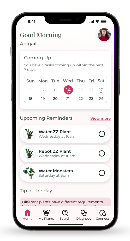
To provide an enjoyable way for users to keep track of their plant-care schedule I’ve added a weekly calendar and checklist on the home page that includes the users’ most important tasks.
To provide users with the correct plant-care information I’ve added 3 bullet points of information on each plant’s page.
To allow users to differentiate each of their plants’ care plans I’ve added a customization screen that will automatically calculate how often they need to water their plants.
Design
Lo-Fi Wireframes
The next step in my design process included drafting out low-fidelity wireframes that included basic layouts to quickly visualize the flow of my project and highlight any usability issues early on in the design process.
This allowed me to then create medium-fidelity wireframes with more details and refinements before adding color and images. Here, the focus was still on making sure each of my content placeholders was vital to solving the users’ problem.
Throughout each stage of my wireframing process, I uncovered more areas for improvement. Specifically, I noticed how important my spacing was and how text hierarchy can play a special role in calling attention to the users.

Moodboard

Throughout the design process, I came across countless examples and pieces of inspiration that I wanted to apply to my project. Using a mood board I was able to narrow down which features I wanted to prioritize in my design to make it feel energized and organized.
I opted for a design that included rounded corners, bold headings, and minimal drop shadows. Using plant photos with white backgrounds helped give the app an organized feel.
Style Guide
My style guide consists of the colors, fonts, and icons I wanted to use to maintain consistency throughout my application. By choosing the Playfair font I’m instilling a sense of knowledge, considering this project is named Plantopedia to resemble an encyclopedia of plants.
For my color choices, I wanted to use a bright fuchsia that would compliment the natural color of the plants and stand out from the competing apps on the market that mainly use shades of green. Fuchsia is known for representing a strong and bold visual identity. To help balance this bright pink I’ve also introduced some softer pinks and greens into the mix.

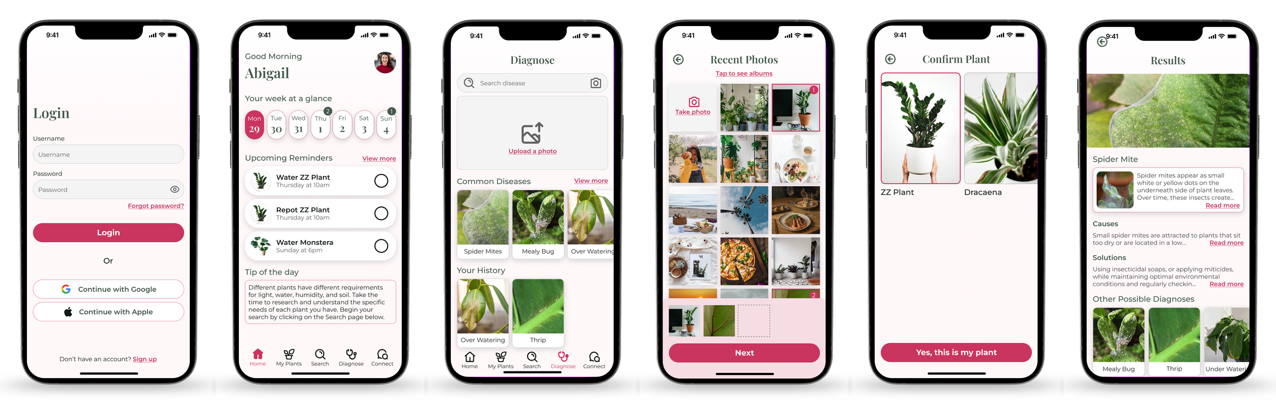
Hi FIdelity UI’s
The final stage of my design refinement before moving on to prototyping and development included drafting out my hi-fi wireframes. These screens included more accurate content, details, and visual styling to further instill a sense of branding across the app to get it as close to the finished product as possible.
Having a highly realistic representation of my final product was crucial before presenting it to users to obtain feedback. The more realistic my wireframes were, the better the feedback on specific interactions would be.
This exercise was one of my favorites because I got to pull ideas straight from my style guide, almost as if it were a master plan for the entire application. I found myself making minor adjustments to my style guide along the process to reflect changes made that better suit the mobile screens. After many iterations, I landed on the following designs.
Prototype
At last, it came time to animate my designs by using the prototype function within Figma.
I animated my user flows determined earlier in my project to get an idea of my screens’ overall flow and usability. This process allowed me to see what it would look like on a life-size phone screen and prompted me to make changes that improved consistency and usability.
Usability testing was conducted to evaluate the usability and effectiveness of the application using a prototype to uncover any obstacles the user faced. I first began by animating my Plantopedia prototype within Figma. Then, I recruited and scheduled 5 users to complete 3 tasks to evaluate overall usability.
Users were recruited using hobby groups, social media, and word of mouth from people in my network. Requirements of my participants included people who were willing to use houseplant tracking applications, who have used houseplant tracking applications in the past, or who have houseplants that they’d like assistance with. 2 users completed an in-person moderated test and 3 users completed a virtual moderated test via Zoom.
I asked participants to complete the following tasks:
Diagnosing a sick houseplant
Updating the care plan for a plant after repotting it
Finding more details about an existing plant
Usability Testing
Results
Once receiving my usability testing feedback I immediately wanted to fix every problem, but I knew I needed to utilize my time wisely.
Utilizing my priority chart I narrowed down the 3 most important fixes that impacted the users' overall ability to solve their problems. I enjoyed this point of my project because I was able to create solutions to the problems identified by firsthand users.

Redesigns
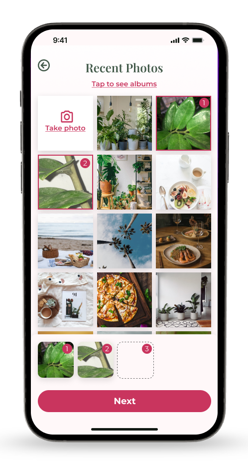
Issue 1: Interactive Elements
When selecting photos of a plant to identify and diagnose, users were unclear on how to select the correct plant on the Confirm Plant page. Users attempted to click on the photo itself instead of scrolling down to the Confirm button.
A solution to this problem could include adding a thicker stroke around the selected plant photo itself and adding a “rediagnose” button on the Confirm Plant page.

Issue 2: Navigation Difficulty
The inline “Edit Plant Care Plan” button on the Specific Plant page was confusing to the user and didn’t draw enough attention. It was only after the user scrolled to the bottom and then back up that they found the small inline button.
Grouping the editable care plan items on the Specific Plant page and placing them in an accordion menu underneath the general plant care details would cause less confusion. Renaming this section to “calculate your care plan” would be more intuitive.

Issue 3: Information Architecture
Users felt that the Plant Info page was lacking functionality and they were unsure of how to share this information with a friend like the task required them to do.
Adding a “share” button and an “add plant to my library” button on the Plant Info page would allow the user to share the info with a friend and provide the page with more functions that will tie in with the rest of the app.
Reflection
This project has allowed me to create something I’m truly passionate about by combining my passion for organization and horticulture. I was able to discover a whole new world quite literally at my “fingertips” and spent hours playing with different screen layout possibilities simply because it brought me joy. Throughout this project, I’ve learned:
The first iteration will not be the last, and that’s okay! In the beginning, I was set on creating screens that were perfect on the first go-around, but I quickly learned that improvements can always be made. My project still has some minor tweaks that could be made, but I learned how to prioritize the issues that affected the users' ability to achieve their goals.
Each user has differing priorities. Instead of developing a project based on my own needs, or one specific user’s needs, I included features that would help a group of houseplant owners. By tailoring the app to benefit a wide variety of users I uncovered areas of improvement including adding a “share info” button and an “upload photos” button to allow users to customize their plants’ homepage.
With more user testing and experience with UX/UI design, I believe I could improve this application even more. Some ideas I have include:
Smart Problem Solving: The ability to troubleshoot houseplant problems based on the user’s previous experiences that were tracked inside the application.
Gamification: Adding a celebratory animation when users complete a task to provide them an overall sense of enjoyment would encourage them to return to the application and therefore keep their plants alive.
Thank you for your time!